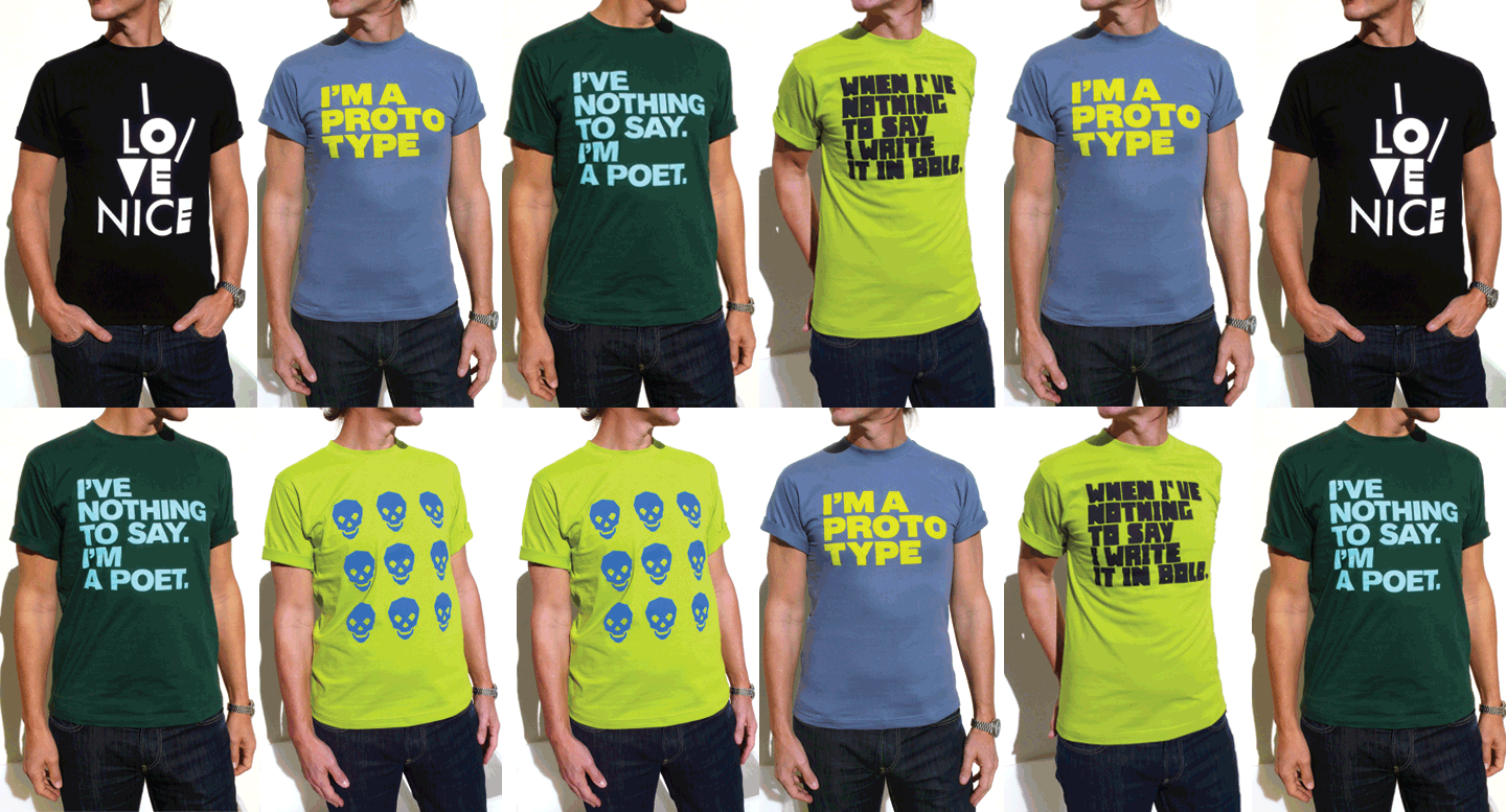
Leonardo Sonnoli with Irene Bacchi designed pro bono a collection of T-shirts and bags to be printed at the silkscreen workshop of the Venice male prison, run by the inmates.
Here the first 5 printed subjects on sale through: info@riotera-ve.it

Leonardo Sonnoli with Irene Bacchi designed pro bono a collection of T-shirts and bags to be printed at the silkscreen workshop of the Venice male prison, run by the inmates.
Here the first 5 printed subjects on sale through: info@riotera-ve.it
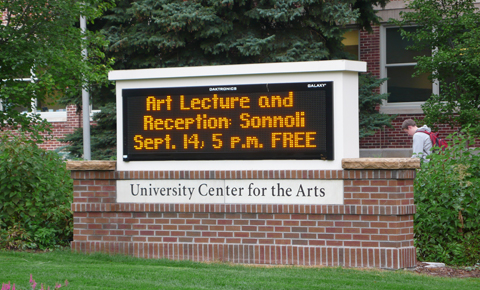
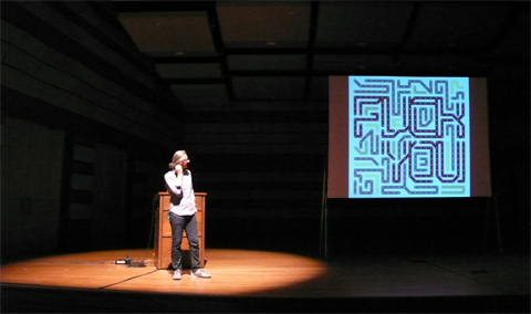
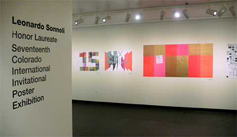
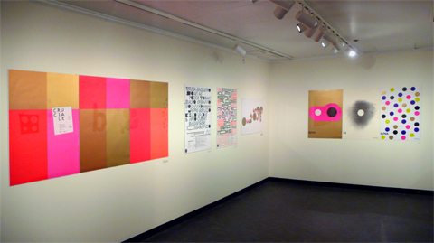
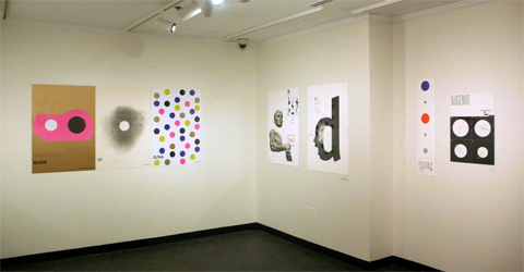
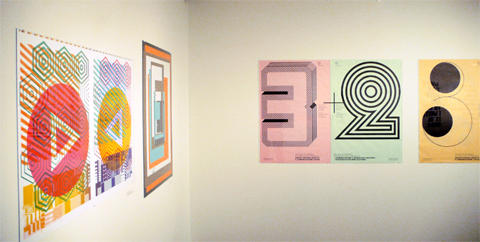
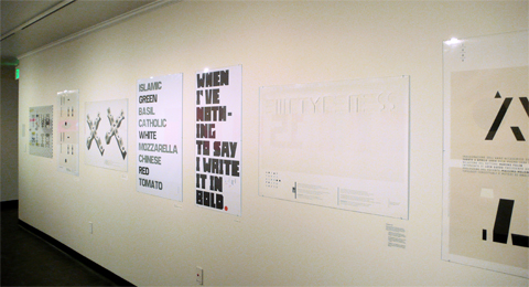
The State of Colorado in the USA is one of the few being a perfect rectangle: its borders trace a shape proportional to a poster landscape size.
From 9.14 to 12.16.2011, at the University Art Museum of the Colorado State University, will be open a poster exhibition by Leonardo Sonnoli.
The event has been organized in occasion of the opening of the 17th Colorado International Invitational Poster Exhibition (see at http://art.colostate.edu/ciipe) together with a lecture at the Griffin Concert Hall.
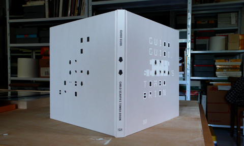
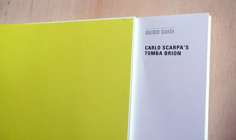
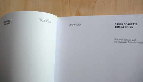
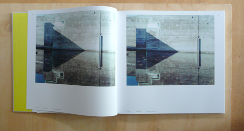
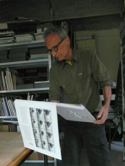
Guido Guidi’s investigation of the Carlo Scarpa’s Brion cemetery began in 1997 as a commission from the Canadian Centre for Architecture in Montreal and lasted ten years, yielding over 600 color photographs taken with an 8-by-10-inch Deardorff camera. This book, published by Hatie Cantz, is not only a summary of this work in 124 pictures but also a manifesto on Guidi’s approach to the photographic book as final tool of the photographer as storyteller: the layout of the sequence has been made by Guido Guidi himself with Leonardo Sonnoli.
The book has been designed by Leonardo Sonnoli with Anna Dalla Via at studio Tassinari/Vetta. The book size come from the 8-by-10-inch photos on a grid of 11-by-11 modules. Eleven is the number who Carlo Scarpa often used in his design.
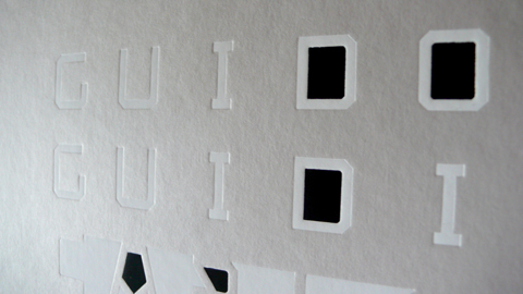
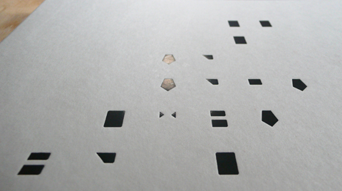
On the typographic cover, the letters and their counter shape play a main role like the filled and empty space in the Tomba Brion.
The light work on the embossed cover, changing through the time, as in the Scarpa’s monument.
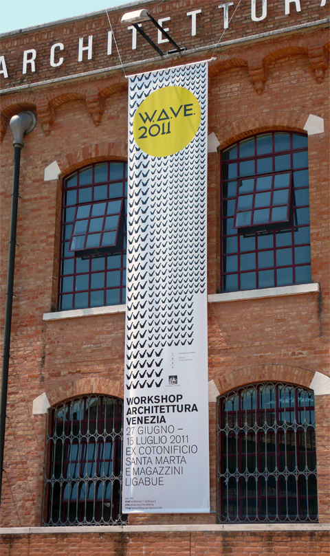
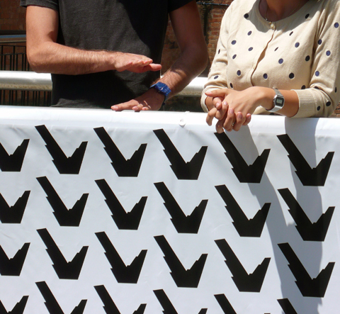
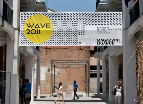
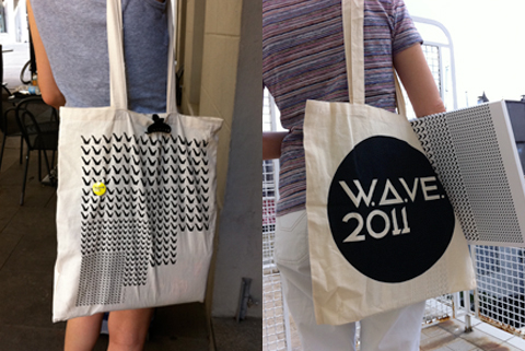
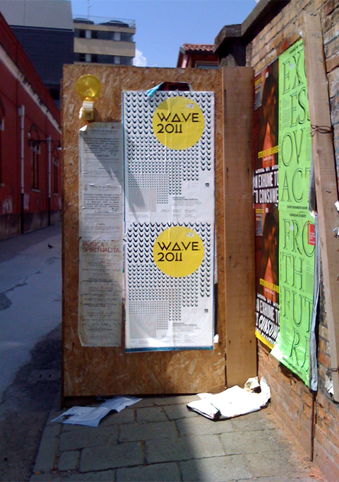
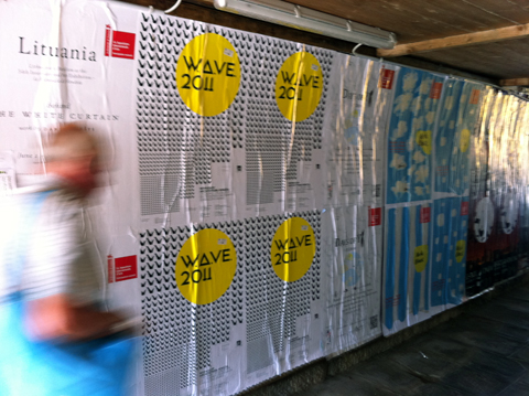
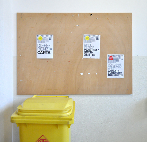
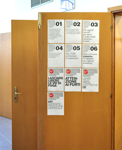
From the 27th of June to the 15th of July the Faculty of Architecture of the University Iuav of Venice organized the 10th edition of the Workshop of Architecture of Venice -known as W.A.Ve.-.
Leonardo Sonnoli with Irene Bacchi designed its visual identity: from the communication through posters, advertising on buses and boats, to the notebooks and bags and the temporary signages and warning signs.
The identity uses a system with a logotype and a moving pattern made with the wings sculpture in front of the Iuav building (designed by Massimo Scolari) duplicated in different sizes to suggest a perspective.
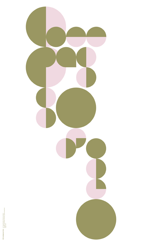
The poster designed by Leonardo Sonnoli on the occasion of the tassinari/vetta’s party for the XXII Compasso d’Oro winnings award
The visual identity and communication design for Napoli Teatro Festival Italia by Leonardo Sonnoli and Paolo Tassinari won the Compasso d’Oro ADI 2011 award for best Italian design products.
Napoli Teatro Festival Italia 2008–2010>
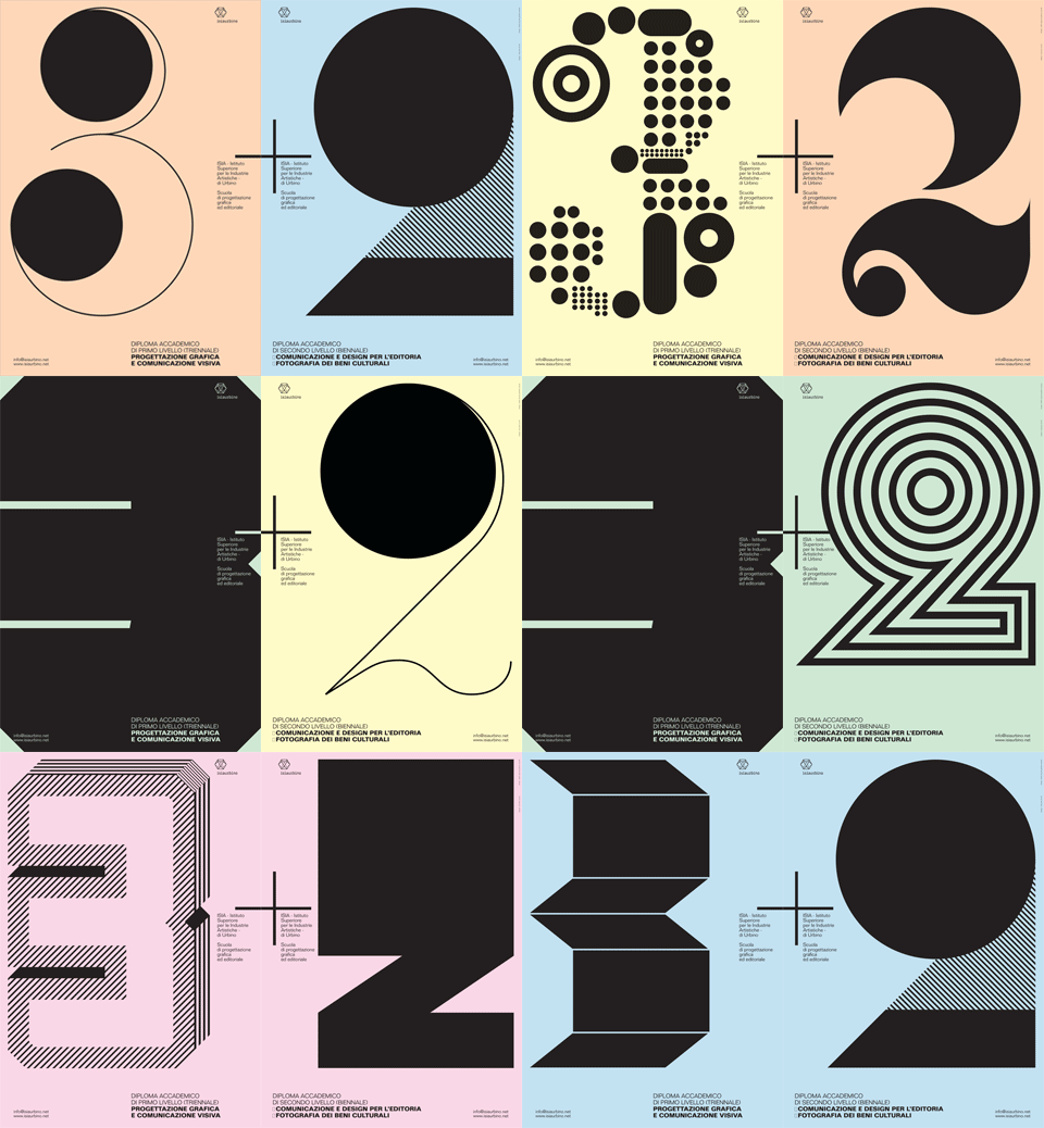
The Isia (Istituto Superiore Industrie Artistiche – www.isiaurbino.net) is the oldest graphic design university in Italy. It’s located in the beautiful renaissance village of Urbino in the central part of Italy.
To promote the courses Leonardo Sonnoli designed a series of five posters printed front and back designing always different 3 and 2 numbers, in reference to the 3 years of Bachelor degree + the 2 years of Masters degree. Printed in black on five colored paper, the posters has been designed to hang by chance 3 and 2 side by side.
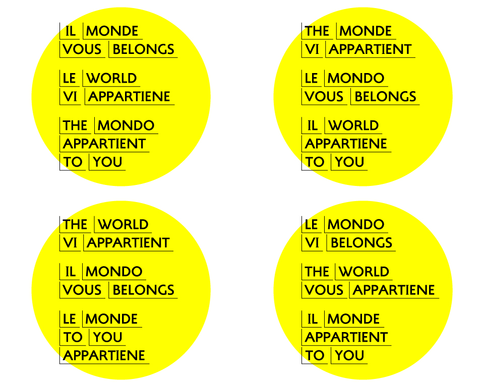
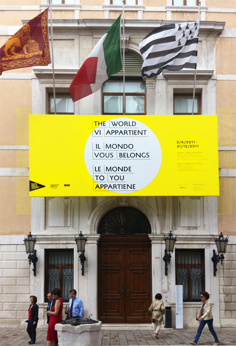
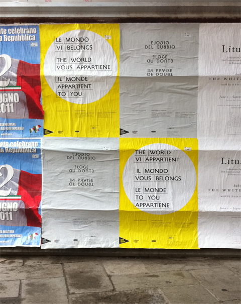
From the 2nd of June it’s open the exhibition Il Mondo vi appartiene / Le monde vous appartient / The World Belongs to You, at Palazzo Grassi in Venice, the François Pinault Foundation’s centre for Contemporary Art -palazzograssi.it-curated by Caroline Bourgeois. The Tassinari/Vetta office designed the event communication:art direction by Leonardo Sonnoli with Anna Dalla Via and Irene Bacchi.
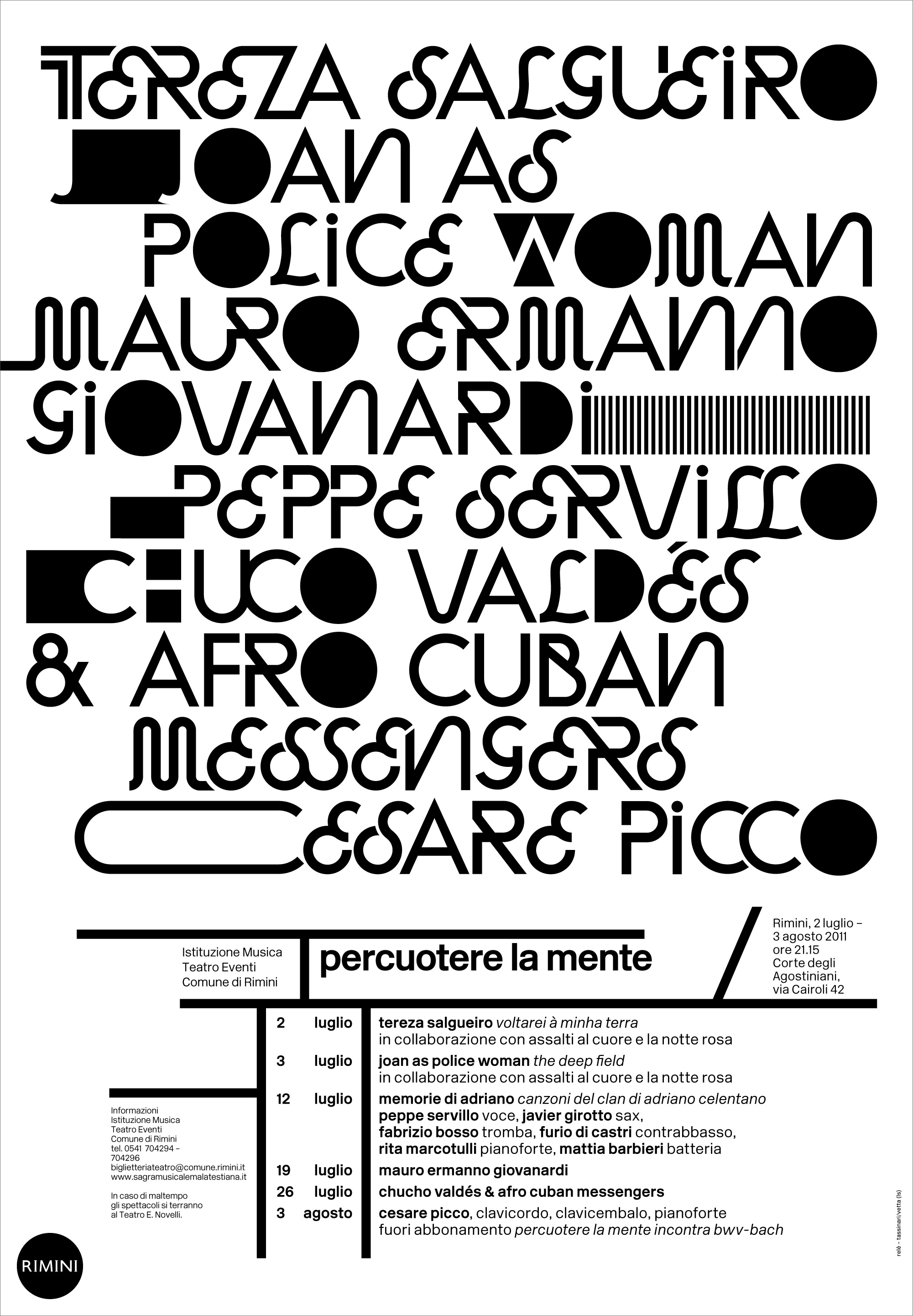
The yearly summer music season organized in Rimini is called “Percuotere la mente” (beating the mind). Leonardo Sonnoli designed the communication (poster, leaflet, ads,…) for the Relè agency. The typo/calligraphic interpretation of the musicians names find its reference in the Gyorgy Ligety music notations.