FRANCO GRIGNANI
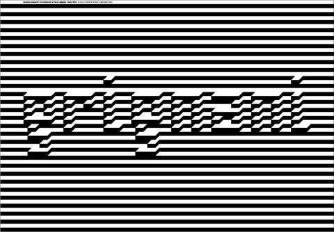
2001, 98 x 68, two side, offset.
Poster-tribute to Gianfranco Grignani one of the most influential italian graphic designer of the post war, made in occasion of a lecture on his work. He was the author of the pure wool mark, and was deeply interested in visual perception.
ALBE STEINER
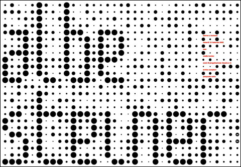
2002, 98 x 68, two side, offset.
Poster-tribute to albe steiner made in occasion of the exhibition in bolzano. The poster was made for the students as info tool
ATOM
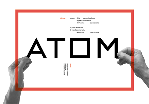
2005, 98 x 68, offset, 3 colors front and back.
poster printed front and back for a lecture in Ljubljana (Slovenia) on history and letters as method to design.
The title refer to a poem of a famous slovenian poet of the twenties titled Atom, that had some typographic element in the original handwritten poem. But also referred to my idea that letters are the atoms of the communication and therefore the most important element to build the communication.
In the front my hands “manage” the letters as objects. On the back the whole poem text, and a text of Pierpaolo Vetta on my works based on type and research of my own cultural roots.
Art direction, design, type design and photo by Leonardo Sonnoli.
LINA BO BARDI ARCHITECT
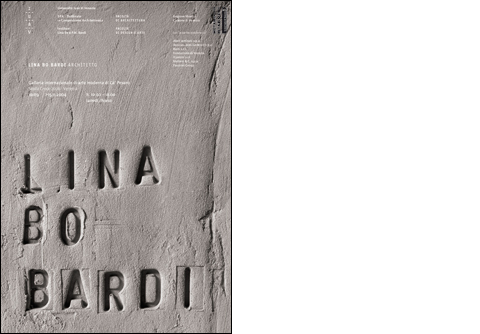
2004, 68×98, series of 3+1, offset + kraft paper putted up.
series of three posters for an exhibition on the italian architect Lina Bo Bardi in Venice. The three poster with just a simple black and white picture of Lina Bo Bardi have a sticking wrapping paper sheet with printed only in black all the information and the logotype “Lina Bo Bardi”. The fourth poster are a typographic composition of her name carved on the concrete, in a brutal way she used in her architecture.
EMPTYPENESS
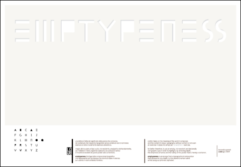
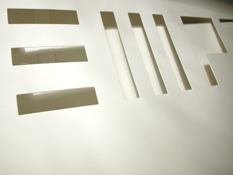
2004, Offset + varnish + dry cutted letters.
Under the request of the International Ningbo Poster Exhibition, to design a typographic poster, I did this critical poster where the type don’t exist. In fact in my opinion, type design is a tool of expression not a purpose. So to avoid to design a type poster for itself , I titled it Emptypeness , cutting out the letters from the poster. A text explaining my intention is written on the bottom. my text on the poster:
“a letter takes on the meaning of the word it composes and the content it relays. typography without content is not even an exercise in style; it is simply an “unaesthetic” exercise.
far better therefore, to use an empty, non-existent and declaredly non-graphic type in order to highlight, by removing depth, the emptiness of sense and the futility of this poster that is merely a container.
emptypeness is an escape from a typographical composition that represents only itself; it is the desire to remain silent whilst using our phonetic alphabet.”
Art direction, design, type design by Leonardo Sonnoli.
EROS AT COLYSEUM
2007, Archeological exhibition at Colyseum.
exhibition design and graphics
FROM LEFT TO RIGHT AND BACK
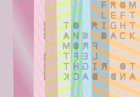
2005, 96×98, 0ffset 4 process colors.
poster designed for my lecture and exhibition in Tehran, titled “From left to right and back”. The title concern both the two different alphabetical system (my, latin, and their, Persian) and my travel from a western country to the middle east.
The poster is composed with many lines-threads , drawing a ideal vision of the persian carpet.
Art direction, design, type design by Leonardo Sonnoli.
PALAZZO GRASSI
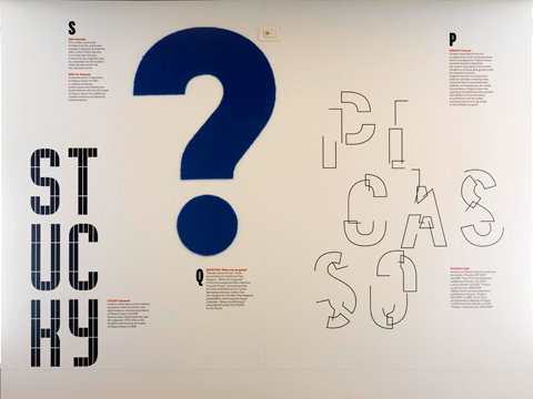
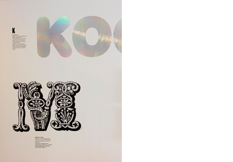
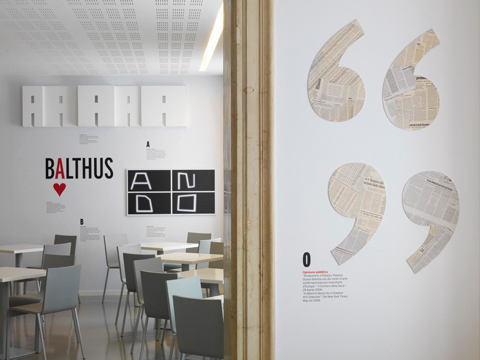
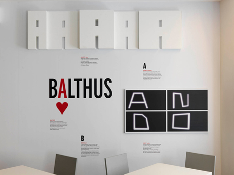
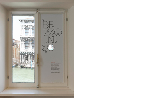
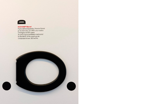
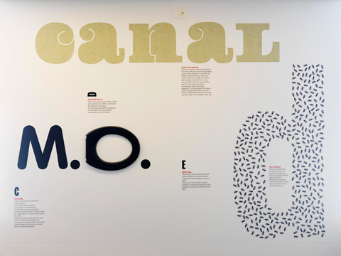
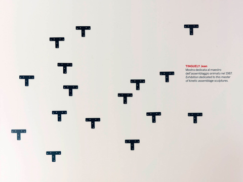
Venice, may 2007
Typographic installation at Palazzo Grassi’s cafeteria (designed by Tadao Ando)
design: Leonardo Sonnoli with Francesco Nicoletti
The several logotypes describe the history of the Palazzo since it has been erected in the 18th century on the Canal Grande in Venice till the last restoration by the japanese architect Tadao Ando. The logotypes illustrate only few of the many names composing the Palazzo’s dictionary, in many materials and types (existing and designed for the occasion).
IDEES – SNCF

2007, 120X175 / 40X60, silkscreen 5 colors.
poster commissioned by the SNCF – French National Railways Company – in occasion of the 70th anniversary. It has been exhibited at the Grand Palais on December 2007. The arrow of the compass indicates the way that the contemporary SNCF follows therefore the developing of new ideas in travelling. The design is an hommage to A. M. Cassandre, the most important french affichiste of the 20th century. In fact the poster is a quotation of the famous Cassandre poster for the North French Railways designed in 1927.
ISOTYPE

2003, 96×98, offset.
Poster-tribute to Isotype and Otto Neurath, made in occasion of the exhibition in Milan. The poster was made for the students as info tool. The title is composed without using type, as Isotype main goal.
S. EX. Sonnoli’s exhibition
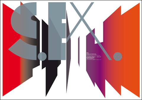
2007, 98×68, printed in offset with one ink (metallic) in one plate and four inks (fluo and black) in another plate (graduation made directly in printing withouit screen)
A selection of posters designed by Leonardo Sonnoli – Tassinari/Vetta.
Ljubljana, 15 march – 11 may 2007
galerija avla nlb
organized by emzin institute of creative production
THE POSTER
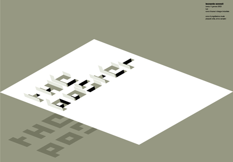
2002, 98×68, offset.
Poster made in occasion of a lecture on posters in Treviso. A meta-poster.
WOLFGANG WEINGART
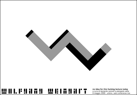
2000, 98×68, offset.
Poster designed in occasion of the lecture of Wolfgang Weingart organised by Leonardo Sonnoli and Pierpaolo Vetta. It was the occasion for the first presentation of his book “My way to typography”.
The “W” as three dimensional impossible object remind not only the double W of his name and surname, but mainly to the always revolutionary approach to typography of Weingart.